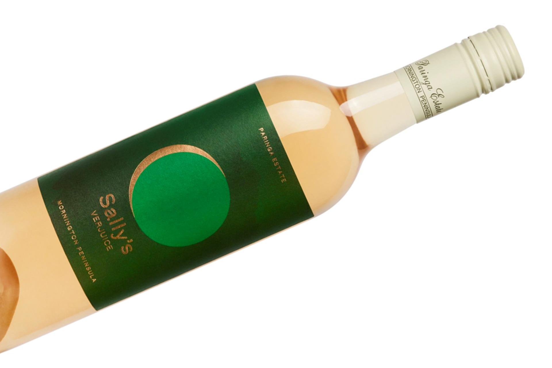

In early summer Paringa Estate do a ‘green harvest’, where they drop unripe fruit from their vines to reduce yields.
And instead of letting the fruit go to waste, they turn the unfermented shiraz and pinot noir grapes into “Sally’s Verjuice” – an ancient mild acidulate which can be used in cooking, preserving and drinks.
We created a label design that represented this early ‘green harvest’, blending a (new) crescent moon whilst also representing the small touch of verjuice – “a slither of gold” – that you would add to your food and drinks to give it that extra wow!
More of a stand-alone product compared to their well known wines, we kept elements of their brand to ensure a level of consistency. The design includes a subtle painted texture of clouds in watercolour, linking back to the painted landscape infamously used on their wine labels.
The label includes a rose gold foil, which beautifully balances out the greens whilst emphasising the details.